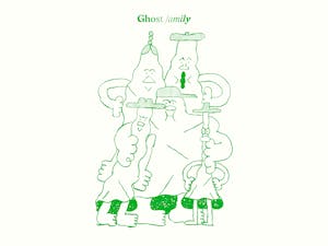
Ghost
Type design, 2025
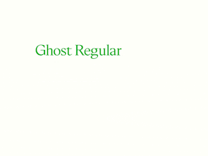
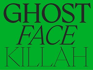
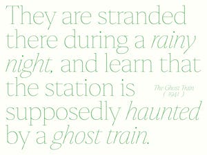
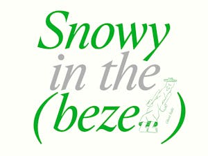
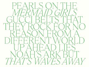
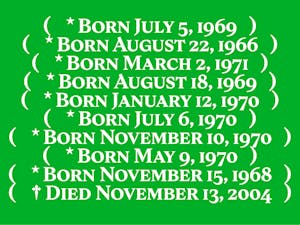
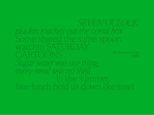
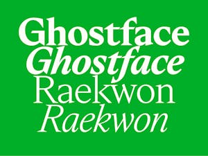
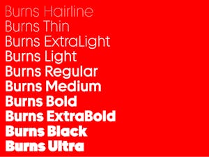
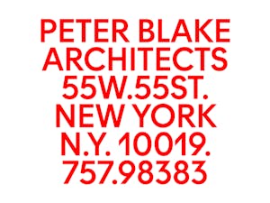
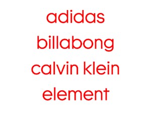
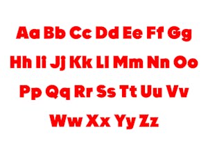
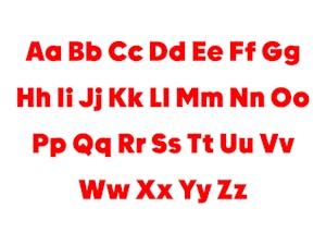
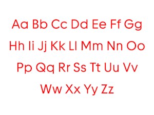
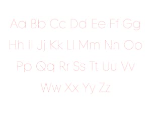
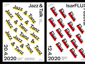
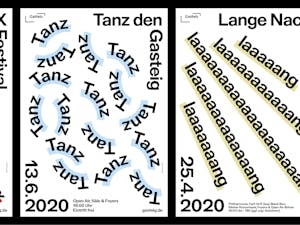
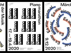
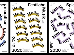
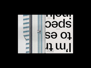
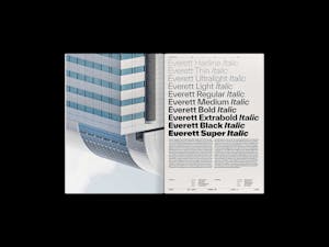
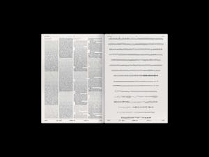
Ghost is a digital serif typeface, carefully drawn with a raw yet elegant touch. First released in only two styles, Regular and Italic, the Ghost font family has now grown to welcome new family members, featuring 14 styles in total. The typeface’s calligraphic axis, combined with sharp triangular serifs and a distinct stroke contrast, makes it robust and versatile. Ghost retains a certain delicacy in small sizes, while showing off all its graphic peculiarities when used in large sizes. It is therefore a polyvalent typeface for editorial design, equally suited to a fashion magazine, the cover of a novel or a photographer’s portfolio. Drawn with the help of Nina Faulhaber and Kasper Pyndt Rasmussen. Illustrations by Anton Erdle. Ghost is available on WELTKERN®.